


|
I'm making the basketball yearbook pages for the 2016 Nichols yearbook. I chose this because I like working with photoshop and I am good at making layouts/ formats. I also chose this because I did basketball, and I feel like I can show the season through the teams eyes. I also like organizing and placing the pictures in photoshop. All I needed for this project were the girls and boys basketball team pictures and playing pictures. I used the pictures taken off of my phone, and adjusted the sizes so that they fit correctly. 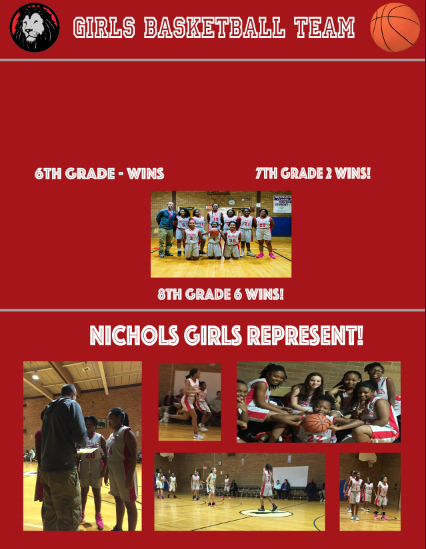 I want to work on the basketball yearbook page because I was apart of basketball, and I feel like I'd be able to know how my teammates want me to do the page. I also want to represent the team.
   1. Each screen shot has a different over all design. The first one is more structured then the last one, but the first one is less structured than the second. Each ones design doesn't only have to do with one concept, it has to do with style and font and other things.
2. The first ones shape is based on the letters that make it. The second one is just letters. The last one hyas more of a wavy shape. 3. I like the first one the most because the style looks cool, and the concept is simple. |
AuthorWrite something about yourself. No need to be fancy, just an overview. ArchivesCategories |


 RSS Feed
